A feedback button can look harmless and still create friction. Put it over a navigation control, trigger it during setup, or ask users to complete seven fields, and a useful feedback channel becomes another interruption.
A well-configured in-app feedback widget stays available without demanding attention. Upvoty treats the widget as the entry point to a larger feedback loop, where submissions can move into voting, prioritization, roadmap communication, and follow-up.
Quick answer: how to set up an in-app feedback widget
Use this sequence to collect useful feedback without interfering with the product experience:
- Define the decision the feedback should support.
- Place the widget where it remains visible but does not cover product controls.
- Show relevant prompts based on page, user state, and completed actions.
- Keep the submission form short and collect context automatically.
- Route, combine, and prioritize submissions in one feedback workflow.
- Acknowledge every submission and follow up when its status changes.
- Test the widget on real screens and measure feedback quality, not just volume.
Define what the in-app feedback widget needs to collect
Start with a product decision, not a form design. A general “Send feedback” option may be appropriate as a permanent channel, but targeted collection works better when the team knows how the responses will be used.
Suppose a B2B reporting application has a report builder at app.example.com/reports/new. Users can select data sources, add filters, and schedule a report. Product analytics show that some users return repeatedly to the filter step without finishing the report, but event data cannot explain why.
The team needs feedback about that specific workflow. It does not need a broad customer satisfaction survey or an open-ended review of the entire application.
Write the internal research question before configuring the widget:
> What prevents users from completing a report after they begin configuring filters?
This question affects everything that follows. It tells the team where to place the prompt, which users should see it, what context to attach, and which submissions belong together.
A permanent feedback button can still accept unrelated ideas. Keep those submissions separate from targeted prompts so a request for dark mode does not appear in the same analysis as report-builder friction.
Choose one primary feedback outcome
An in-app feedback widget commonly supports several jobs:
- Reporting a product problem
- Requesting a feature or improvement
- Explaining difficulty during a workflow
- Commenting on a recently released change
- Voting for an existing request
- Providing account-specific context to the product team
Do not ask one prompt to do all six. A user reporting broken filter behavior needs different fields from someone suggesting a new export format.
If several outcomes matter, begin with a simple category choice. Once the user selects “Report a problem” or “Suggest an improvement,” show only the fields relevant to that path. Conditional forms add one click, but they remove irrelevant questions and improve routing.
Choose the best placement for an in-app feedback widget
Widget placement should provide predictable access without competing with the action a user came to complete. Persistent access is usually more useful than an aggressive pop-up because users can submit feedback at the moment they encounter a problem.
For the reporting application, the team initially puts a floating button in the lower-right corner of app.example.com/reports/new. During testing, it covers the date picker’s confirmation control on a 13-inch laptop. The button works on a large design canvas but fails in the actual interface.
Move it to the lower-left corner on that route, where the application has no persistent controls. Keep the lower-right position on account and dashboard pages. Placement does not have to be identical across every screen.
The following comparison helps match placement to the product interface:
| Placement | Best use | Main risk | Practical safeguard |
|---|---|---|---|
| Lower-right floating button | Products with open space beside the main workspace | Covers chat, save, or confirmation controls | Check every breakpoint and offset it from fixed controls |
| Lower-left floating button | Interfaces with right-side actions or chat | Conflicts with navigation expansion or mobile browser controls | Collapse it to an icon on narrow screens |
| Header or help menu | Dense dashboards with little free screen space | Users may not notice it when a problem occurs | Use a clear “Feedback” label rather than an ambiguous icon |
| Contextual link beside a feature | Feedback about one component or workflow | Can appear like part of the primary action | Use subdued styling and name the subject clearly |
| Temporary inline prompt | Feedback after a completed action or release | Becomes disruptive if shown repeatedly | Trigger once after success and provide a permanent dismissal |
Protect mobile and keyboard users
Test placement at actual viewport widths rather than resizing a desktop browser once. Mobile keyboards, sticky navigation, cookie notices, support chat, and browser controls can all reduce usable space.
The widget trigger must also be reachable and understandable without a mouse. Use a visible focus state, a meaningful accessible name, and logical focus behavior when the panel opens. The W3C guidance for minimum target size explains why small controls placed close to other actions are difficult for users with limited pointer accuracy.
When the panel closes, return focus to the widget trigger. Do not drop the user at the start of the page. If the panel behaves as a modal dialog, prevent keyboard focus from moving into the obscured interface behind it.
Avoid interface collisions
Create an inventory of fixed and sticky elements before launch. Include support chat, cookie controls, mobile navigation, save bars, onboarding prompts, and browser-specific overlays.
Open every combination that users can reasonably encounter. A widget that is safe by itself may block a control when a support window is expanded. Assign a clear priority when elements collide. The feedback widget should generally move or collapse rather than covering a product action.
Write in-app feedback prompts that respect the user’s task
A permanent widget trigger does not need an attention-seeking message. Label it “Feedback,” “Share feedback,” or “Suggest an improvement.” Avoid labels such as “Tell us what you think” when the destination accepts bug reports and feature requests, because the label does not explain what will happen.
Targeted prompts need more care. Ask about something the user has just experienced, and wait until the associated action is complete.
For the reporting example, the first prompt is triggered when a user spends 60 seconds on the filter step. That produces weak feedback. Some users are reading field definitions or comparing options, and the prompt interrupts them before a problem exists.
A better trigger uses behavior rather than elapsed time alone. Show a small invitation after the user removes and re-adds a filter, encounters a validation error, or leaves an unfinished report and returns to it. The prompt can say:
> What made this filter difficult to configure?
That wording identifies the subject without assuming the feature is broken. It is more useful than “How can we improve?” because responses remain tied to a known step.
Use passive invitations before active prompts
Begin with the least intrusive presentation that can produce enough responses. A persistent button is passive. A highlighted badge is more noticeable. An inline question or pop-up actively competes for attention.
Escalate only when the research need justifies it. If the team receives enough relevant reports from a passive widget, adding a pop-up creates cost without much new information.
When an active prompt is necessary, display it after a natural stopping point such as saving a report, finishing onboarding, or using a new feature. Never cover an error message or appear between a click and the result of that click.
Give users a real dismissal option. Once dismissed, suppress the prompt for an appropriate period or permanently for that campaign. A close button that causes the same prompt to return on the next page is not a dismissal.
Target the in-app feedback widget by page and user context
Broad targeting creates broad, difficult-to-interpret feedback. A prompt about advanced report filters shown to every account will reach people who have never used them.
For the reporting application, target users who have permission to create reports and have interacted with at least one filter control. Exclude trial users still completing initial setup if the filter workflow is not part of their current task. Also exclude employees, test accounts, and automated sessions.
Useful targeting dimensions include page or route, account plan, role, lifecycle stage, feature access, prior behavior, and whether the user has already responded. Use only dimensions that change how the team will interpret or act on the feedback.
Segmentation can also reveal conflicting needs. An administrator managing 200 scheduled reports may request bulk controls, while a first-time user may need clearer field labels. Combining those requests into one count hides the product decisions behind them.
Record the relevant segment with the submission where possible. Do not ask users to identify their plan, role, or current page if the application already knows it.
Limit prompt frequency across the product
Separate campaigns can accidentally stack. A user might qualify for a report-builder question, a release survey, and an onboarding check-in during one session.
Set a product-wide frequency rule, not only a limit within each campaign. Active prompts should have priority based on urgency and relevance. Passive access through the widget can remain available even when targeted prompts are suppressed.
Keep a campaign register showing the audience, route, trigger, start date, end date, and owner. This makes overlap visible before release.
Keep in-app feedback submission fields short
Every required field should change triage, diagnosis, or follow-up. If the team cannot explain how a field affects one of those activities, remove it.
For the filter prompt, the visible form can start with one required question: “What were you trying to do, and what got in the way?” The form may offer an optional screenshot and an optional contact permission setting if identity is not already known.
Attach available technical and product context in the background. That could include the route, application version, browser, account segment, selected feedback category, and the trigger that opened the form. Avoid collecting sensitive page content or form values by default.
A practical initial form is short:
- One clear, open-text description field
- An optional screenshot or attachment
- A category selected by the opening path, not repeated as a question
- Automatically captured route and product context
- User identity only when needed and permitted
- Consent or visibility controls where the use of the submission requires them
Do not force users to estimate severity. “Critical” means something different to each person. Product and support teams can assess operational severity after reading the report and checking account context.
Handle privacy before collecting extra context
Data collection should be purposeful and limited. The European Commission’s overview of EU data protection rules covers obligations that may apply when feedback identifies a person or includes personal information.
Decide whether submissions are private, visible to other users, or moved to a public board. Tell the user before publishing their text or identity. If a private suggestion may later become a public feature request, rewrite or anonymize it rather than exposing the original submission automatically.
Screenshots require particular care because they can capture names, email addresses, customer records, or internal business data. Provide a way to review the image before sending it. Redaction should happen before the file enters the feedback system whenever possible.
Route and prioritize feedback after submission
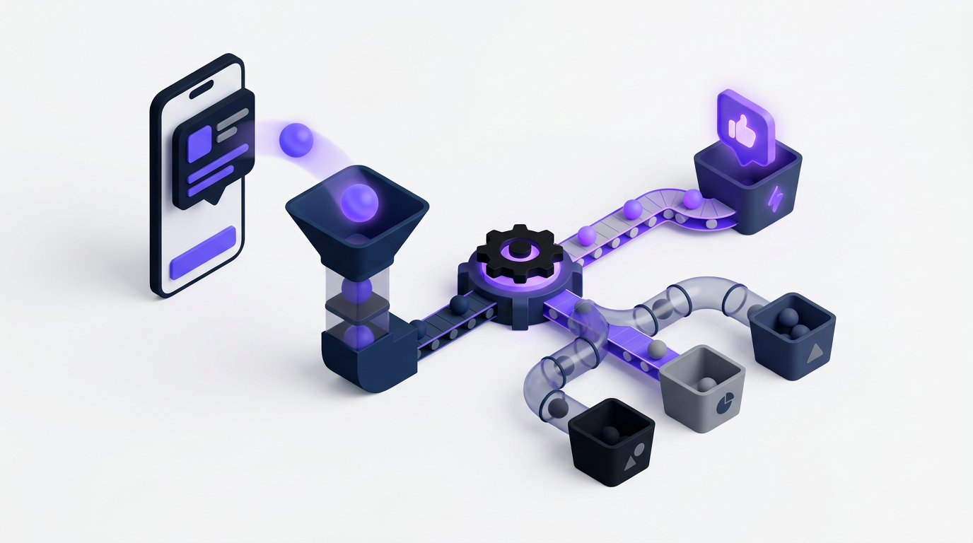
Collection is only useful when submissions reach an owned workflow. Sending every widget entry to a shared email inbox produces duplicate requests, inconsistent labels, and uncertain responsibility.
For the reporting example, route filter-related submissions to a report-builder board. Tag them with the affected step and user segment. A report that describes broken validation should also reach the team responsible for defects, while a request for reusable filter groups belongs in the feature request workflow.
Search for existing requests before creating a new item. If five users describe reusable filters in different terms, merge those submissions into one request while preserving their comments and account context. Votes provide demand evidence, but they should not be treated as an automatic priority score.
A request from a high-revenue segment, a compliance blocker, and a frequently requested cosmetic change require different evaluation. The guide to customer feedback prioritization by revenue, segment, and demand explains how to retain those distinctions instead of sorting by vote count alone.
Assign each accepted item an owner and status. Internal notes should explain why reports were combined, rejected, or moved. This prevents the next reviewer from repeating the same investigation.
How Upvoty connects the in-app feedback widget to follow-up
A widget should not end at submission. In Upvoty, the user starts with the in-app feedback widget inside the product, while the product team connects that entry point to a managed feedback process.
First, configure the widget and decide which feedback board should receive submissions. The trigger remains inside the application, so users do not need to leave their current product context to start a request.
Next, shape the questions around the type of feedback being collected. Upvoty’s custom submit forms let teams request relevant details rather than applying one generic form to bugs, workflow problems, and feature ideas.
Once submitted, requests can be reviewed and organized on feedback boards. Similar ideas can be managed together, and other users can add their demand through voting rather than producing a growing set of duplicates.
This is what the feedback management view looks like when requests move beyond the widget into an operating queue.
!Upvoty dashboard for managing feedback submissions and feature requests
The product team can then assess requests with the account and segment context available to it. Accepted work can move onto a product roadmap, where customers get a controlled view of planned, active, or completed work rather than promises hidden in support replies.
Finally, voters can receive updates through automatic notifications as a request changes status. When an improvement ships, a changelog gives the team a place to explain what changed and who benefits.
This ordered flow removes repeated copying between a widget, spreadsheet, support inbox, voting board, and release email. Teams still need to make product decisions. The software preserves the evidence and communication trail around those decisions.
Follow up without creating more friction
Immediately confirm that the submission was received. Keep the confirmation specific and modest: “Your feedback was sent to the product team” is better than promising a personal response or delivery date that the team cannot support.
If the user reported a blocking problem, provide the appropriate support route in the confirmation. A feedback queue should not replace incident handling or account support.
Status updates should correspond to meaningful events. Useful updates include clarification requested, under review, planned, in progress, released, or declined. Avoid sending messages for administrative changes that do not affect the user.
When declining an idea, explain the constraint when it is safe to do so. A concise note about limited use, conflict with the current product direction, or an available alternative is more credible than leaving the request “under review” indefinitely.
For accepted requests, communicate scope carefully. A user who requested reusable report filters may assume the feature includes team sharing, permissions, templates, and bulk application. State what the released version actually supports.
A public roadmap can make this process visible, but it needs status definitions and disciplined updates. The practical guide to building a public product roadmap customers can trust covers how to communicate direction without turning every item into a fixed delivery promise.
After release, close the loop with the people who submitted or voted for the request. Explain the result, point to the relevant product location, and invite feedback on the implemented change. Upvoty’s article on closing the customer feedback loop with a changelog shows how release communication completes the process.
Test whether the in-app feedback widget is disrupting users
Review the widget in a staging environment first, then test it with real product configurations. Empty demo accounts often have more free screen space and fewer interface states than active customer accounts.
Check desktop and mobile layouts, zoomed views, keyboard navigation, slow network behavior, long translated labels, dark mode, validation errors, and pages with support chat open. Submit test entries from each targeting condition and confirm that routing, tags, identity, and notifications are correct.
Do not judge success by submission volume alone. A disruptive prompt can increase response count while damaging task completion and collecting rushed comments.
Track whether the widget overlaps controls, whether users dismiss targeted prompts, whether form completion drops at a particular field, and whether submissions contain enough context to act. Compare completion behavior before and after active prompts are introduced. If a campaign produces many vague responses, narrow the target or rewrite the question before increasing its visibility.
In the reporting example, the team should review whether targeted users complete report creation after dismissing or submitting feedback. It should also inspect the percentage of responses tied to a reproducible issue, an existing request, or a clear unmet need. That assessment reveals more than a raw count.
Run the widget as a maintained product surface. Assign an owner, audit active prompts on a schedule, remove expired campaigns, and review categories as the application changes.
Common in-app feedback widget mistakes
The most common failure is treating installation as completion. The widget appears in the product, submissions arrive, and nobody owns what happens next.
Another mistake is opening the form automatically on every visit. This may produce an early spike in responses, but it teaches users to close the prompt without reading it. Use behavioral targeting and frequency controls instead.
Long forms also reduce quality. Users start with a precise observation, then abandon it when asked for department, company size, satisfaction score, priority, category, and contact details. Capture known context automatically and request clarification later when necessary.
A less visible problem is publishing private feedback without clear permission. Requests copied to a public board may contain customer names, internal processes, or account-specific data. Review and anonymize them first.
Finally, do not let voting become the only prioritization method. Public voting measures expressed demand among participating users. It does not measure technical risk, strategic fit, contractual obligations, or the needs of users who do not visit the board.
In-app feedback widget FAQ
Should an in-app feedback widget open automatically?
Usually not. Keep a passive feedback trigger available and reserve automatic or expanded prompts for a specific, time-limited research question. Trigger them after a relevant action, limit frequency across the whole product, and remember a user’s dismissal.
Where should I put a feedback widget in a SaaS product?
Use a location that remains easy to find without covering navigation, save controls, chat, or mobile browser elements. Lower-right works in many products, but dense interfaces may need lower-left placement, a header link, or a contextual link beside the relevant feature. Test each route and breakpoint.
How many fields should an in-app feedback form have?
Start with one required description field. Add optional evidence such as a screenshot, then collect route, account segment, browser, and product context automatically where appropriate. Add another required field only when it changes routing or makes the submission meaningfully easier to diagnose.
Should feedback submitted in the app be public?
Not by default. Treat the original submission as private unless the user is clearly told it will be public. If an idea belongs on a public voting board, remove personal or account-specific information and make the visibility change explicit.
Can an in-app feedback widget replace customer support?
No. It can collect product ideas, usability problems, and non-urgent reports, but users need a separate route for account issues, outages, security concerns, and other time-sensitive problems. Show the support option in the widget confirmation when the selected category suggests urgency.
How do I know if the widget is collecting useful feedback?
Review how many submissions can be routed without follow-up, connected to existing requests, reproduced, or translated into a clear product decision. Also monitor prompt dismissals, form abandonment, and task completion. High response volume with vague comments is not a successful setup.
What should happen after a user submits a feature request?
Acknowledge it, check for duplicates, preserve the user and account context, and assign an owner. Tell voters when the status meaningfully changes. If the request is released or declined, explain the outcome rather than leaving it under review indefinitely.
Set up the widget where users can reach it without leaving their task, then connect every submission to an owned follow-up process. Use Upvoty to build that feedback loop from in-app collection through voting, roadmap updates, and release communication. Read next: Website Feedback Widget. Read next: How Shopify Brands Can Add an In-App Feedback Widget to Their Store.